
CLIENT
Svensk Byggtjänst · B2B SaaS
ROLE
Senior Product & UX Designer
DURATION
May 21-Aug. 24
FOCUS
Navigation, search, IA, content UX, design system; WCAG 2.1 AA
TEAM
Product, Tech, Editorial, Customer Support
TOOLS
RELATED
Context
AMA Online is a professional knowledge tool with dense, rule-based content used in real projects under time pressure. Even experienced users struggled to know where to start, find the right section confidently, understand "what applies" to their case, and work efficiently over time without support or training.
The product had grown over years with fragmented patterns, inconsistent terminology and legacy UI decisions creating high cognitive load and low trust in the interface.
BEFORE
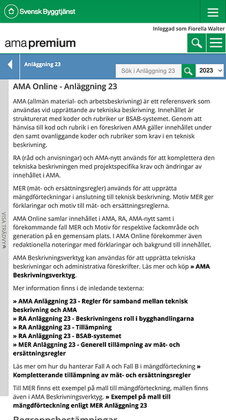
BEFORE

Users were expected to know where to start and how to interpret results, without guidance.
Legacy AMA Online- fragmented navigation, dense content, inconsistent interaction patterns.
The problem
The core problem wasn't lack of content. It was lack of guidance and structure.
Users didn't fail because they couldn't search. They failed because the system didn't provide predictable paths to the right content, clear ownership of what they had access to, consistent reading patterns for complex material, or a stable interface language across areas and devices. This increased reliance on support and slowed adoption of the digital product compared to printed manuals.
Goals & success criteria
Project goals
-
Reduce cognitive load and increase confidence in navigation and search
-
Make "first steps" obvious for both new and returning users
-
Improve readability and scannability of standards content
-
Create a scalable UI foundation (design system) for future development
-
Ensure accessibility is built in (WCAG 2.1 AA)
Success signals
-
Higher task success in usability testing
-
Faster time-to-content for common workflows
-
Fewer support tickets tied to access, navigation and terminology
-
Behavioural confirmation in analytics / Hotjar (improved flow through core paths)
Constraints
-
Complex, legally sensitive content with strict editorial rules
-
Legacy technical structure and multiple product areas
-
Mixed user maturity (beginners and experts)
-
Required accessibility compliance and consistency with printed AMA logic
My role
Senior Product & Service Designer, responsible for product UX strategy and execution for the AMA Online interface. I led the UX audit of the legacy interface, research synthesis into workflow-based needs, IA direction and validation, design system creation, interaction design for search, navigation and reading patterns, alignment across product, editorial, marketing and development, and internal validation through tests, walkthroughs and design QA.
Approach
1
Diagnose the UX debt
I mapped friction across the daily product experience where users got lost, what labels confused them, where navigation broke mental models, and where dense content caused scanning failure. Output: a prioritised problem set tied to user workflows and support patterns.
2
Ground the structure in workflows
Research synthesis showed success correlated more with workflow maturity than role name. I reframed audiences into behaviour-based groups (e.g. beginners vs power users), clarifying where the greatest impact would be: first-time clarity plus repeat-use efficiency.
3
Rebuild wayfinding & entry points
I redesigned how users orient and start: clear entry into the right "area" so users don't guess, a predictable navigation model across sections, and reduced ambiguity in labels and content grouping.
4
Make search predictable (and results usable)
Search isn't valuable if results can't be interpreted. I focused on meaningful filters and content-type structure, scannable results that support fast decisions, and consistent patterns for moving from search to applying.
5
Design for reading
Standards content is not "read like an article". I introduced stable reading patterns: hierarchy and typography inspired by AMA books, clear structure for dense rule-based material, and consistent UI logic for definitions, references and sections.
6
Build the design system as governance
To stop fragmentation, I created a scalable design system: grids, buttons, forms, navigation patterns; component logic for dense layouts; terminology and UX writing rules; and accessibility baked into tokens and components.
7
Validate and iterate
I validated direction through internal walkthroughs with experts and customer support, usability testing (task success and confidence), behavioural confirmation, and structured design QA across product areas to reduce inconsistencies.
PROCESS

PROCESS

Mapping UX debt through audits, workshops and expert walkthroughs reframing IA around workflow maturity rather than job titles.
AFTER

Clear entry points and predictable navigation reduced guesswork and improved first-time confidence.
AFTER

Search redesigned for interpretation, filtering and confident decision-making.
AFTER

A scalable design system built as governance, consistency, accessibility and long-term maintainability.
Key solutions
Clear structure for dense professional workflows
A more consistent interaction model across areas, so users could learn the interface once and reuse it everywhere.
Search and navigation that work together
Instead of treating search as "the solution", I ensured navigation, filters, labels and results presentation jointly support decision-making.
Content readability built for scanning under pressure
Hierarchy and content patterns that support quick scanning, safe interpretation and reduced misreading risk. This is where the "professional tool" credibility is won.
Accessibility as a foundation, not a layer
Accessibility designed into typography and contrast, interaction patterns, predictable structure and component rules, not added as manual fixes.
Outcomes
This work resulted in a more cohesive, accessible and professional product experience.
-
Improved clarity and confidence in daily use
-
Reduced dependency on support for wayfinding and interpretation
-
Increased activation and adoption easier to start and easier to return to
-
A scalable UI foundation for future development inside AMA Online
It also created a platform foundation that later enabled exploration of guided and AI-assisted workflows.
Key Learnings
-
Structure creates trust. In complex domains, users don't trust "features" they trust predictable structure, consistent terminology and stable patterns.
-
Design systems are change management. A design system isn't UI polish; it's governance that prevents fragmentation and aligns teams over time.
-
Workflow-first beats role-first. Segmenting users by workflow maturity clarified priorities better than designing for job titles.
-
Accessibility improves everyone's speed. Designed for clarity under constraints, all users benefit not only those with impairments.
-
Alignment is a deliverable. Recording walkthroughs, making rationale visible and tying decisions to outcomes reduced resistance across silos.