Government · Public Sector · Accessibility·2020
Healthcare information at national scale
Leading UX research and design for Sweden's national health authority website restructuring a large content ecosystem for clarity, accessibility and trust across diverse user groups.
CLIENT
Socialstyrelsen · Government / B2B
FOCUS
Accessibility, IA, navigation, complex content; WCAG 2.1 AA + Swedish DOS Act
ROLE
Senior UX/UI Designer
TEAM
UX/UI Designer, content owners, developers, stakeholders
DURATION
2020
DURATION
Figma, accessibility testing tools
The challenge
Socialstyrelsen needed to modernise its national web platform to better support healthcare professionals, administrators and strategists. The challenge: restructure a large, complex content ecosystem while ensuring high accessibility standards, regulatory compliance and clarity across very different user groups.
This was a public website at national scale used during real moments of need, including pandemic information and professional licensing where clarity and accessibility weren't features, they were obligations.
My role
I led UX research and UX/UI design in a cross-functional team, acting as the bridge between users, content owners, developers and stakeholders.
Key responsibilities
-
UX research, user interviews, usability testing, workshops
-
Information architecture and navigation design
-
Interaction design and prototyping
-
Accessibility strategy, WCAG 2.1 AA and the Swedish DOS Act (Lag om tillgänglighet till digital offentlig service)
-
Design system and style guide update
Research
Research was conducted with healthcare professionals, strategists, administrators and social service representatives through usability testing, interviews and structured workshops.
Key responsibilities
-
Search was the primary entry point. Users arrived via Google and relied heavily on on-site search to navigate complex content
-
Navigation and content structure were difficult to scan, especially for time-constrained professionals
-
The national guidelines were the most critical content but the hardest to locate and understand, due to naming, hierarchy and visual affordances
-
Clickable elements weren't perceived as interactive, causing missed content
-
Accessibility issues affected both usability and trust, particularly for visually impaired users
RESEARCH

RESEARCH

Checkout required understanding complex licensing upfront, high cognitive load at the critical moment.
Design & solutions
Navigation & information architecture
-
Reworked main navigation and content groupings
-
Reduced cognitive load and content duplication
-
Improved orientation and sense of place across the platform
Search & findability
-
Clarified search-result structure and filtering logic
-
Improved distinction between content types (pages, documents, data)
Visual hierarchy & interaction clarity
-
Improved affordances for clickable elements
-
Clearer hierarchy for text-heavy pages
Accessibility & design system
-
Updated typography, contrast and components to meet WCAG
-
Strengthened consistency through design-system updates
AFTER

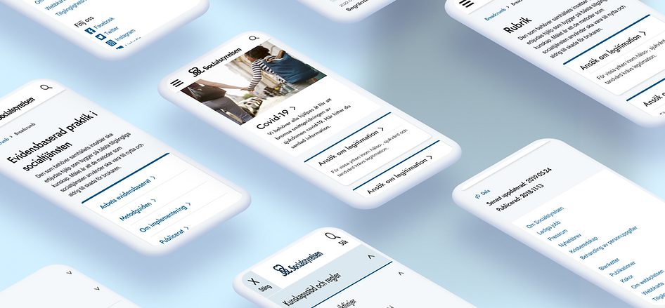
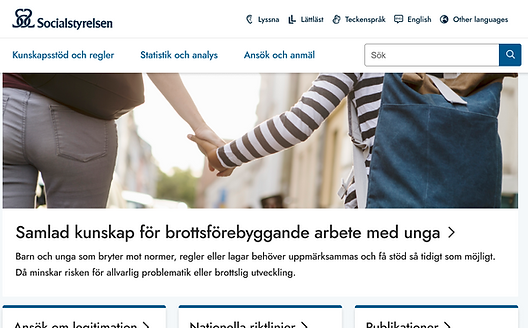
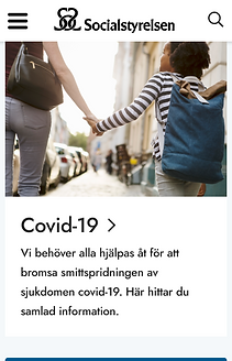
Restructured information architecture across the national platform.
AFTER

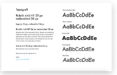
Updated style guide and components, accessibility-first.
AFTER
.png)
AFTER
.png)
Impact & outcome
-
Improved usability and navigation across the national platform
-
Increased user satisfaction, especially for visually impaired users
-
Strengthened accessibility, performance, SEO and responsiveness
-
Delivered a future-proof foundation for continued digital development
Learnings
This project reinforced the importance of observing user behaviour beyond what users say, especially in high-stakes, information-dense environments.
Designing for accessibility at this scale isn't a constraint. It's a quality driver that improves clarity, trust and usability for everyone.