
BIOTRUE — BAUSCH + LOMB
Conversion-driven UX for a regulated consumer health brand I 2019
Client
Bausch + Lomb | B2C
Brand
Biotrue
Role
UX/UI Designer
Type
Campaign landing page & conversion optimisation
Overview
Designing a high-conversion landing experience that connected paid social campaigns with real-world action, balancing brand trust, medical credibility, and user motivation in a regulated healthcare context.
The project focused on turning awareness into measurable conversion while maintaining consistency with Bausch + Lomb’s brand and regulatory requirements.
The Challenge
Biotrue was running awareness campaigns across social media channels, but the post-click experience lacked clarity, focus, and momentum.
The core challenge was not just to inform, but to:
-
Convert interest into action
-
Reduce friction between campaign message and landing experience
-
Build trust in a medical brand context
-
Support users with varying eye conditions and levels of motivation
Goals & Success Criteria
-
Increase conversion from campaign traffic
-
Drive qualified email sign-ups
-
Guide users toward optician visits
-
Maintain brand credibility and medical trust
-
Ensure clarity, accessibility and ease of use on mobile
-
Success was measured primarily through conversion rate and engagement after launch.

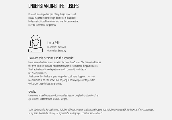
Understanding the Users
User research included stakeholder interviews and qualitative user insights to understand motivations, hesitations and decision drivers.
Primary audience
-
People with nearsightedness, farsightedness or astigmatism
-
Users experiencing eye strain or discomfort
-
Social-media active users exposed to campaign messaging
Key insights
-
Users wanted reassurance and simplicity, not medical complexity
-
Trust and clarity were critical for taking the next step
-
Visual hierarchy and copy length strongly affected engagement
Design Approach
Based on research and campaign goals, I designed the landing page to:
-
Continue the emotional tone and message from social media
-
Reduce cognitive load and visual noise
-
Prioritise one clear action at a time
-
Support decision-making without overwhelming users
The work included:
-
Information architecture and sitemap
-
Wireframes and interaction flows
-
Low- and high-fidelity prototypes
-
UI components aligned with brand guidelines
-
Mobile-first usability testing and iteration

"Based on the landing page purpose, the flow was correctly built but small changes like making the text bigger, changing the font and having more space was a must based on the audience's perspective and goals for each one"
Prototyping & Usability Testing
High-fidelity prototypes were tested to validate flow, readability and perceived trust.
Key improvements based on testing:
-
Increased text size and spacing for readability
-
Clearer visual hierarchy and CTA prominence
-
Reduced copy density to improve scanning
-
Adjusted typography and contrast to support comfort and accessibility
These refinements ensured the experience supported both user goals and business objectives.
Results
-
+43% conversion rate within the first week
-
+76% conversion rate after two weeks
-
Increased engagement from campaign traffic
-
Strong positive feedback from affiliated optician partners
-
Users were more willing to try the product before committing to purchase
Outcome
The final solution successfully connected marketing intent with user behaviour, delivering measurable business impact while maintaining brand trust and medical credibility.
This project demonstrates how conversion-driven UX, content strategy and usability design can work together to drive results in a regulated consumer health environment.