
PodME
Anytime Anyplace
Project in Short
Client
PodMe – Premium Podcast Platform | B2C I Subscription I Audio
Duration
October 2020 – March 2021
Project Type
Mobile-first B2C product with subscription-based access to exclusive podcast content. The work focused on improving acquisition, onboarding flow, and conversion through UX, content, and structure. As well some redesign of the design components.
Team Setup
Senior Product Designer (Lead)
Tech Lead
Developers
Collaboration with the Head of Marketing
Content Producer
Tools
XD
Google Analytics
Screaming Frog
Apple App Analytics
Google Play Console
Platform Focus
Mobile-first B2C product with subscription-based access to exclusive podcast content. The work focused on improving acquisition, onboarding flow, and conversion through UX, content, and structure.
Languages Used
Swedish
The Need
PodMe is a subscription-based platform offering exclusive podcast content. Despite having popular shows like Mordpodden and Slutna Sällskapet, the brand lacked awareness among listeners. Most users discovered episodes through Google searches, not by seeking out PodMe as a platform.
The goal of the project was to improve onboarding and subscriber conversion. However, user research revealed deeper issues: the product journey was fragmented, with friction at every step.
New users landed on a marketing page focused entirely on app downloads, with no option to listen directly via web. This created a major drop-off, especially for time-sensitive users who just wanted to try a podcast. SEO had not been prioritized, and metadata issues made it difficult to find PodMe organically.
Even those who downloaded the app often churned before completing sign-up, blocked by long forms, required card input, or forced social logins. These hurdles undermined the value of the 30-day free trial and created confusion about what users were actually signing up for.
The need wasn’t just to improve onboarding, it was to rethink the entire entry experience: from SEO and first landing, to registration, listening, and retention.
Key challenges
-
Low brand awareness despite high interest in specific podcast content
-
Users found PodMe via Google, but were funneled into an app-only experience with no web listening option
-
SEO was neglected, poor metadata, no optimized landing for discoverability
-
Long registration forms and required card input before trial created unnecessary friction
-
Forced social logins led to user frustration and drop-off
-
The core value of the free trial was lost in early funnel steps
-
Design component issues: weak contrast and unclear UI after login made interactions confusing for new users
-
Marketing and product teams weren’t aligned on what users actually needed to convert
My Role & Responsibilities
As the Senior UX Designer on the project, I was responsible for diagnosing friction in the onboarding flow and proposing solutions that aligned with both user behavior and business goals.
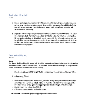
I began with funnel analysis and qualitative research to understand how users discovered PodMe, what motivated them, and where they dropped off. I led user interviews and usability testing focused on real-world behavior, simulating how users searched for specific podcasts, landed on the site, and attempted to register or start listening.
During testing, I measured how long it took users to understand the offer, complete onboarding tasks, or decide to abandon the flow entirely. I compared those baselines with performance after implementing design changes, revealing a clear improvement in time-to-value and engagement.
The insights reframed the entire scope: onboarding wasn’t just an in-app issue, it started at discovery. I restructured the user journey from search and landing page to registration and first listen, removing friction and creating optionality in how users began their experience.
Key challenges
-
Led user interviews and usability tests with task timing and behavioral observation
-
Conducted funnel analysis and identified major drop-off points using analytics tools
-
Reframed onboarding scope to include marketing page, not just in-app flow
-
Redesigned the onboarding process to reduce steps and offer web-first access
-
Removed social login after identifying it as a blocker in testing
-
Simplified messaging and clarified value proposition on the landing page
-
Identified and resolved UI accessibility issues (contrast, CTA clarity) post-login
-
Facilitated cross-team prioritization of onboarding and SEO in the product roadmap
Impact & Results
For Users
-
Transparent onboarding that clarified what PodMe offers, how to get started, and where to listen
-
Faster access to content by removing app download as a required first step
-
Simplified registration, no social login, no card entry before trial
-
Clearer messaging and visual structure, increasing trust and time-to-value
-
Choice to listen via web or app, depending on user preference
-
Improved experience across platforms, leading to higher user satisfaction in testing
For Business
-
Increased subscriber conversion following changes to onboarding flow
-
Higher completion rates of free trial sign-up
-
Improved SEO strategy and metadata structure, stronger organic traffic
-
Stronger brand perception at first contact, leading to increased trust
-
Product positioning better aligned with user behavior and real discovery patterns
Process & Methods
Discovery / Define
The discovery phase focused on understanding where and why users were dropping off, not only in the app, but throughout the entire acquisition and onboarding journey. I worked across product, marketing, and tech to reframe onboarding as a full-funnel challenge, from SEO and first landing to trial start and activation.
We combined analytics, user interviews, and content audits to identify key friction points. These included unclear value messaging, forced app installs, and a registration process that blocked momentum. Based on these insights, we realigned the product strategy to prioritize immediacy, optionality, and trust.
One unexpected but powerful insight emerged during user research: while users still cared about shows and genres, they often made real-time listening decisions based on how much time they had. If they had 15 minutes, they wanted a 15-minute episode — not a 60-minute one they’d have to pause mid-way.
This insight led to two key strategic shifts:
-
I brought in the content team to explore new short-format podcast content, specifically created for 15 minute sessions, which didn’t exist in the catalog at the time.
-
I advocated for a feature that would remember playback position across devices, so users wouldn’t have to search for where they left off.
These changes helped reframe the product experience around daily routines, time management, and listener intent — opening up new angles for retention and content strategy.
Methods
-
Funnel analysis using App Analytics, Google Play Console, and Google Analytics
-
SEO audit using Screaming Frog to surface visibility gaps
-
In-depth user interviews + task-based testing (focused on discovery and conversion)
-
Persona development based on podcast consumption behavior and intent
-
Card sorting to restructure landing page and onboarding flows
-
Wireframing and high-fidelity prototyping for mobile and web
-
Usability testing, including guerrilla methods, to validate design direction
-
Behavioral mapping of “first-listen journeys” across web and app


Depth interviews

Podcast Enthusiasts, Web Browser Listeners

Cardsorting
Ideation & Implementation
Due to tight timelines and high urgency around conversion, we worked in fast, iterative cycles rather than traditional prototyping and validation.
Instead of full prototypes, I translated insights directly into design updates, reworking flows, restructuring the landing page, and simplifying registration in close collaboration with development. Wireframes were delivered in short cycles to ensure fast implementation.
Key decisions included:
-
Introducing guest access and allowing users to start with just an email
-
Delaying card input until after the trial period to build trust
-
Removing social login to reduce friction
-
Giving users the option to listen via web immediately after signup
-
Highlighting short-form content for time-sensitive listeners
-
Recommending playback memory so users could easily resume listening
-
Clarifying CTAs and value messaging throughout the onboarding journey
Guerrilla usability testing confirmed that users felt more confident engaging with PodMe after these adjustments, particularly when card input was no longer required upfront.
Early results showed a rise in trial completions and a measurable increase in paid subscriptions.


The before


Prototype
Reflection & Learnings
This project highlighted the power of aligning real user behavior with business objectives, not just by removing friction, but by rethinking what value looks like in the moments that matter.
By combining data with deep qualitative insights, I was able to shift the focus from "how to get users into the app" to "how to let users start listening as fast and confidently as possible." That small change in perspective reshaped both the onboarding flow and the product’s entry strategy.
It also reinforced a key truth in subscription-based products: trust is everything. Delaying card entry, removing social logins, and clarifying messaging weren't just UX wins, they were business levers. And by identifying a new listening behavior, time-based intent, I was able to influence not just design, but content strategy and roadmap planning.
Finally, this case reminded me that fast, iterative work, grounded in insight and backed by collaboration, can create meaningful, measurable impact, even under tight constraints.